Blog

  • Boost Your Website’s Style & Speed with These 20+ CSS Loader Tools

    One of the fundamental principles of User Experience (UX) is that a visitor expects to see some feedback when they do actionable work on a website or an app. For example, when you click on a download button to download a file to your machine, the file processes in the background. On the front, till the file is ready, we want to let the user know that some process is running in the background, and they have to wait for a few seconds till the download begins. Here the CSS loader can be helpful. Let’s see the best and unique CSS loaders.

    If the website shows nothing, most users will conclude that something is wrong with your site. By doing this, they will be able to navigate away before they realize your site has been processing their request!

    You don’t want that to happen, so to solve this issue in CSS, we have the concept of adding a ‘loading’ state. This animation lets the user know that their request has been received and that the site is loading some relevant information.

    Now, how to make one? If you have never coded a CSS loader, or just want to get some inspiration for some of the best ones, we have curated it all for you in this article.

    Tailwind CSS Spinners (Loaders)

    1. Flowbite Spinner

    Flowbite’s pre-built spinner components offer a versatile and efficient solution for visually indicating loading states within your application. With customizable options for color, size, and style, you can seamlessly integrate spinners into various UI elements like buttons, forms, or content sections to enhance user experience during data fetching operations.

    By providing clear visual feedback, Flowbite spinners contribute to a more responsive and intuitive user interface.

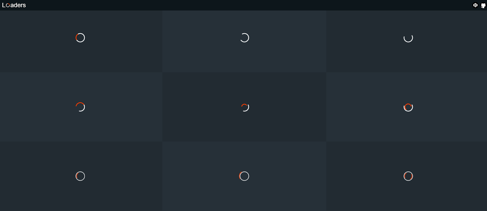
    2. Preline UI Loaders

    This is an open-source Tailwind CSS components loading library for any needs. Comes with UI examples & blocks, loader templates, plugins, Figma design system.

    3. Material Tailwind CSS Spinners

    By Utilizing CreativeTim’s Material Tailwind CSS Spinner to catch your users’ attention during loading. This will make the experience smooth and interesting.

    Easily integrate this spinner animation into your website, and let it do the work while you focus on delivering exceptional user experiences.

    4. UIVerse Loaders

    Transform dull loading screens into captivating experiences. Uiverse offers a rich library of open-source loaders that any developer can easily use those to improve app performance and user satisfaction.
    This is Open-Source loaders made with Tailwind CSS & available free for everyone.

    User-Friendly Tailwind CSS Admin Dashboard Template

    Spike Tailwind admin dashboard is your gateway to beautiful design and efficient development.

    Download it for free and build faster dashboards with this tailwind template.


    CSS Loaders (CodePen)

    The following CSS loaders are available as CodePen demos:

    CSS Loader

    1. Neumorphism Gradient Loader

    This loader is a mixed breed of both neumorphism and gradient design – the two highly trending things in the frontend world as of now.

    What’s unique?

    It heavily relies on box-shadows , pseudo-classes and the filter property to achieve this effect.

    // Box shadow
    box-shadow: -5px -5px 5px rgba(255, 255, 255, 0.1),
        10px 10px 10px rgba(0, 0, 0, 0.4),
        inset -5px -5px 5px rgba(255, 255, 255, 0.2),
        inset 10px 10px 10px rgba(0, 0, 0, 0.4);
    // Pseudo class
    .loader:before {
      content: "";
      .
      .
      .
    }
    // Filter property
    filter: blur(20px);
    

    2. Loading Animation w/ Translate and Z-index

    These blue-shaped circles showcase the best depth effect between themselves thanks to the different z-index values they have. They also animate on top of each other for a more natural transition.

    What’s unique?

    Not only z-index, but also it has some cool blue linear-gradient and transform properties on the x-axis.

    // Linear gradient
    background: linear-gradient(45deg,
          rgba(2,0,36,1) 0%,
          rgba(9,9,121,1) 35%,
          rgba(0,212,255,1) 100%);
    // Z-index and transforms
    @keyframes move-1 {
      0%   {z-index: 3; transform: translateX(0);}
      .
      .
      .
      100% {z-index: 1; transform: translateX(0);}
    }
    

    3. Pure CSS loader #30: 1 element metaballs animation

    Well, here is a meatball sticking to various other balls (circles) in a smooth animation.

    Take a look at how it attaches to two and one of the balls on different axes. This is something appreciable!

    What’s unique?

    First of all, the code is in SASS (.scss) and therefore you can expect some cool use cases of the same with custom variables, @for flow control, and CSS blend mode.

    // Custom variables
    $n: 10;
    $r: 1.5em;
    $oa: -90deg;
    $ba: 360deg/$n;
    $hl: 2*$r;
    .
    .
    .
    // Flow control
    @for $i from 0 to $n {
            $ca: $oa + $i*$ba;
            $sh: $sh, 
                    $rc*cos($ca) $rc*sin($ca) currentcolor
    }
    // Blend mode
    .loader {
           .
           .
           .
            mix-blend-mode: multiply;
           .
           .
           .
    }
    

    4. Pure CSS loader #31 – 1 element swappy

    Here’s a cool swappy animation where you have a box container inside which we have a circle that morphs or ‘swaps’ away from its shape after a set interval of time. It goes from a circle to a square to again a circle.

    What’s unique?

    1. The animation values can be changed dynamically as per your liking as it uses SASS variables.
    2. The use of @for inside the animation @keyframes code.
    3. Use of clip-path to morph the shape.
    // Dynamic animation 
    body {  .
            .
            .
            animation: fsx 4*$t steps(1) infinite
    }
    // Use of @for inside @keyframes
    @keyframes fbg {
            @for $i from 0 to $n {
                    #{$i/$n*100%} { background: nth($c, $i + 1) }
            }
    }
    // Use of clip-path
    @keyframes exp {
            0%, #{$q} { clip-path: inset(0 .5*$d $d round 50%) }
            100% { clip-path: inset(0 round 50%/ 0) }
    }

    5. Spiral Loading

    Need something infinite? This loading animation goes on and on with a soothing spiral shape. The good part is that towards the end it fades away and towards its origin, it stays solid white. It gives an immersive and soothing loading experience.

    What’s unique?

    You can change the number of circles you want to have in the spiral, the diameter, radius, and duration. It makes a ring of circles by using the transform: rotate() function.

    // Control the amount of circles, diameter, radius and duration
    .circle {
      $circle-count: 60;
      $circle-diameter: 0.5em;
      $ring-radius: 4em;
      $duration: 3s;
      .
      .
      .
    }
    // Using rotate() to make a ring of circles
    transform: rotate($ratio * 720deg) translateX($ring-radius);
    

    6. Liquid Loader

    Imagine a loader that is like a two-way open pipe. On one end, it takes in some liquid, and on the other one, it spits out the same liquid. Sound weird?

    Then add an ultra-cool gradient to it and make it realistic with amazing shadow play. This is the liquid loader you don’t want to miss to take a look!

    What’s unique?

    It uses CSS filter property and many of the CSS-SVG values like stop-colorstroke-dasharray and more!

    // CSS filter
    .skugga {
      filter: blur(5px);
      .
      .
      .
    }
    // CSS-SVG values
    .strecken {
      stroke-dasharray: 26 54;
      fill: none;
      stroke: url(#gradient);
      stroke-width: 23;
      stroke-linecap: round;
    }
    

    7. Gradient Spinner

    This looks like the perfect match for your upcoming meditation or breathing app. Or maybe it can also be used on a smart home appliance website where you want to mimic the dial functionality via a loading animation.

    What makes it great is the choice of animation speed and the gradient color. It’s not too much and it fits so well!

    What’s unique?

    1. Use of linear-gradient values.
    2. It uses the blur filter.
    3. Pseudo-classes like :nth-child() and :after are used..loader {
      .
      .
      .
      background: linear-gradient(#f07e6e, #84cdfa, #5ad1cd);
      animation: animate 1.2s linear infinite;}

    8. Hexagon Loading With CSS (2)

    It’s nothing but one of the simplest animations you can offer on your website. A thin-line hexagon forms itself and completes its shape in a loop.

    What’s unique?

    It achieves this effect by using the transform: rotate() function and with extra cautious values of @keyframes.

    // Use of rotate
    div:nth-of-type(2){transform:rotate(60deg)}
    div:nth-of-type(3){transform:rotate(-60deg)}
    // Use of precise values in @keyframes
    @keyframes load1 {
      0%{bottom:0;height:0}
      6.944444444%{bottom:0;height:100%}
      50%{top:0;height:100%}
      59.944444433%{top:0;height:0}
    /*   91.6666667%{top:0;height:0%;} */
    }
    

    9. Terminal Spinner

    In love with your terminal where you run various commands? Well, then why not make a CSS loader out of it?

    This one is monochrome (just as all terminal things should be), it flashes and blinks in a conform cycle and it does it all well!

    What’s unique?

    The clever use of pseudo-classes combined with an animation block, which in itself uses the content property.

    // Pseudo class
    .spinner:after {
      animation: changeContent .8s linear infinite;
      display: block;
      content: "⠋";
      font-size: 80px;
    }
    // The animation block
    @keyframes changeContent {
      10% { content: "⠙"; }
      20% { content: "⠹"; }
      30% { content: "⠸"; }
      40% { content: "⠼"; }
      50% { content: "⠴"; }
      60% { content: "⠦"; }
      70% { content: "⠧"; }
      80% { content: "⠇"; }
      90% { content: "⠏"; }
    }
    

    10. Weird Loader

    Talk about loaders being drunk! This is a set of two circles that feel like they are competing with each other in the Weirdest of All Competition!

    If your website is funky and quite animated, then this one will suit you the best.

    What’s unique?

    It has some of the best animation stops used which gives it a weird animation feel

    // Use of animation stops
    @keyframes circle--1 {
            0% {
                    top: 50%;
            }
            50% {
                    top: 120%;
            }
            100% {
                    top: 50%;
            }
    }
    @keyframes circle--2 {
            0% {
                    top: 50%;
            }
            50% {
                    top: -50%;
            }
            100% {
                    top: 50%;
            }
    }
    

    Misc CSS Loader Libraries and Resources

    This mixed bag of tools contains some of the best loader libraries and other miscellaneous resources.


    1. CSS Load.net

    The first of the lot is a loader generator with a preset of tons of editable spinning animations right from the browser!

    All you need to do is select an animation preset, change its color, size, and speed, and then hit the ‘Get the code’ button. It will give you both the HTML and CSS needed to bake that animation right into your project.


    2. Epic Spinners

    Developed by Epicmax and designed by Vasili Savitski, Epic Spinners is a great collection of CSS-only spinners ranging from a ‘flower spinner’ to a ‘trinity rings spinner’.

    The examples shown here are as epic as their name. Once you select a spinner or your choice, it will show you the HTML + CSS code. Not only that, but it also has VueJS support. So you can also simply copy the Vue code too!


    3. LOADING.io

    This one is a collection of CSS loading animations dedicated to speed, and simplicity and is dev-friendly.

    The beautiful part is that the size of each icon is less than 1KB even before it’s minimized! To use, just click the loader you want, get the CSS code, copy it to your CSS file, and then finally copy the HTML wherever you want to implement that loader.


    4. Spinkit

    If you are someone who likes the route of simple things then Spinkit offers just that. It uses the bare minimum requirements needed to achieve the spin or the loading effect.

    With the transform and opacity properties, it’s amazing to see how many different loading spinners can be made! You can also check out its  GitHub repo.


    5. 30 CSS Page Preload Animations

    As the name suggests, this provides you with a total of 30 loading animations ranging from some square and round animations to the other 10+ miscellaneous loaders at your disposal.

    These animations are best suited for content that takes some time to load like an image gallery. You can easily customize them as it’s made with vanilla CSS.


    6. CSS Loaders

    A general situation that we all might face while going through websites/apps is to wait for something to get loaded. Considering this, created a collection of such loaders. It’s developed using pure CSS. Hence, it will load fast and is easily customizable too.

    Each loader has been build on top of a single HTML tag, so that it is easily portable. Hence, more convenient to be integrated with projects.


    7. LDRS 

    Open-source loading animations for your next project

    A collection of 44 lightweight loaders & spinners. Available as web components for drop-in usage, or copy-paste HTML and CSS.

    Features of LDRS – 

    ✓ Purposefully designed — Unique enough to be interesting. Simple enough to actually use.

    ✓ Customizable — Set the size, color, speed, line weight and more

    ✓ Tiny — Dues-paying member of the iddy biddy bundle committee

    ✓ No GIFs — Built with HTML, modern CSS and some sleek SVG

    ✓ Typed — No one likes a squiggly red underline

    ✓ Zero dependencies — Zero worries 🍻


    We hope you liked these cool and unique CSS loading animation resources. You can use your favorite ones as all of them have great documentation and come with plenty of examples and use cases.

    If you are looking for React MUI Admin Dashboard Template then you can check out below useful Admin Template which can save you time, money, and energy:

    Modernize Free React MUI Dashboard

    Also if you’re looking for pre-built Material UI Templates that could skyrocket your development process, then visit the page now.

    If you are also looking for CSS Animation Resources then please check out this article : 22+ Best CSS Animation Resources.

    Good luck!

  • Ultimate React⚛️Resource Collection, Every Developer Should Bookmark 📌

    Every developer needs resources! Whether you are just starting to learn the most popular JavaScript library or you’re already a pro in it, there are an immense number of resources both free and paid from where you can take some inspiration. Learn new concepts, or just listen to some podcasts.

    Here in this article, we are going to see more than the Top React Resources.

    React Resources:

    Here, are some of the best ones out there that you, as a React dev, should bookmark and use as a reference whenever required. They range from courses to learn React to some of the coolest events happening worldwide.

    Courses

    Courses are one of the useful React Resources to Learn:

    1. React Tutorial: Learn modern React from scratch, and practice in an intuitive environment. Throughout this course, you will build an online supermarket shopping app with Stripe integration.
    2. React Training: This is a comprehensive list of courses provided by the team of professionals from the React Training group. The same people who made React Router.
    3. React by ui.dev: From React Redux to Router and exclusive events, you get all in this course.
    4. Learn React for free: Learn all the key concepts while building two apps and doing interactive coding challenges along the way via Scrimba’s intuitive platform.
    5. React for Beginners: This is a premium step-by-step training course from Wes Bos to get you building real-world React.js + Firebase apps and website components.
    6. Complete Intro to React, v5: This Frontend Masters course starts from the ground up, getting to using the latest features in React, including hooks, effects, context, and portals.
    7. Building Web Applications with React: A complete collection of individual resources from Pluralsight. It starts by introducing the fundamentals of React. It then dives into how to design, style, and server render components, manage state, and test and optimize your application.
    8. Kati Frantz’s courses: Kati makes both free and paid React courses which include technologies like TypeScript, NodeJS, and testing.
    9. Epic React: More than a course, Epic React is a series of code-along interactive workshops by Kent C. Dodds which includes topics like Advanced React Patterns, React Performance, and more!
    10. React Security: Ryan Chenkie’s React Security is a series of courses, all aligned to get you to know how to add essential security features to your React application.

    Podcasts

    Podcasts are also one of the learning audio format React Resources.

    1. React 30: A 30-minute podcast about React and all things JavaScript.
    2. React Podcast: One of the oldest and most favorite podcasts which covers a variety of topics in the React ecosystem. It has 100+ episodes.
    3. React Roundup: A podcast dedicated to React and the community.

    Events

    This React Resource will help you to connect with React Community members in events:

    1. Reactjsday: From the organizers of events like JSDay, this year’s ReactJS Day has talks from industry leaders who will talk about testing, React Native, React Hooks, and more!
    2. Reactiveconf: The yearly conference targeted to connect the European tech community is holding this event with 10 workshops, 5+ speakers, and topics like PWA, Security, Optimization, and much more.
    3. React Wednesdays: React Wednesdays is a weekly chat show with the best and brightest from the React world with TJ VanToll, Principal Developer Advocate.
    4. Byteconf React: Byteconf React is a 100% free two-day conference with the best React speakers and teachers in the world.
    5. Community conferences: An official collection of all the upcoming React events.

    Articles/Blogs

    1. ReactJS Official Blog: A definitive thing to bookmark! Get ready to read all the things new to each version of React on their official website.
    2. Devglan: Devglan serves as a comprehensive hub where individuals can access a wealth of valuable resources, carefully selected and organized for their convenience.
    3. Feedly: Feedly is the fastest way to track the topics and trends that matter to you.
    4. Smashing Magazine: If you’re looking for high-quality React articles, then Smashing Magazine is a must. They have a wide and in-depth tutorial on a variety of topics.
    5. LogRocket Blog: LogRocket’s blogs are updated weekly. They have a bonus section on reference guides as well.
    6. DEV Community: An ever-growing community of developers who write and share their thoughts on the React ecosystem.
    7. Freecodecamp: The beginner’s favorite platform has a bunch of updated and quality articles for React posted regularly.
    8. Robin Wieruch’s Blog: A huge collection of articles comes from Robin who takes on topics like React Hooks, Redux, NodeJS, etc.
    9. Dave Ceddia’s Blog: Dave is a software engineer whose articles mainly cover the React ecosystem along with various other technologies like Tailwind, Git, Svelte, etc.
    10. Flavio Copes Blog: If you need some bite-sized tutorials or explanations, then Flavio masters it. The articles explain a small problem and solutions.

    Books/E-Books

    If you need books or e-books as React Resources, then they are as below:

    1. React from Zero by Kay Plößer: It’s a 20-lesson book that takes you step-by-step through how React works, using simple JavaScript.
    2. React JS Notes for Professionals by Goal Kicker: This book is written by people at Stackoverflow and has over 20 chapters detailing the important parts of ReactJS.
    3. The React Handbook by Flavio Copes: This book focuses heavily on learning some JavaScript concepts before diving into React topics.
    4. The Road To React by Robin Wieruch: A highly popular book that comes in three forms – The Bare Essentials, The Essentials, and The Professional.
    5. Pure React by Dave Ceddia: This book goes beyond by properly explaining why React is essential and teaches you how to build clones of big products like Slack, Reddit, Hacker News, and Pinterest.
    6. React Explained by Zac Gordon: Learn all the essential React concepts and make a final project at the end of databases and CRUD functionality.
    7. Learn React Hooks by Daniel Bugl: In this guide, you’ll be making a complex UI application with React Hooks while also learning about Context API.
    8. Learning React, 2nd Edition by Alex Banks and Eve Porcello: First you will learn how to work with functional programming and the latest ECMAScript features. Then you will be able to look at how React works under the hood.
    9. Fullstack React by Anthony Accomazzo, Nate Murray, Ari Lerner, Clay Allsopp, David Guttman, and Tyler McGinnis: This book has a huge resource of 15 chapters, sample apps, and detailed explanations and is up-to-date with the recent changes.
    10. React in Action by Mark Tielens Thomas: This book focuses on introducing front-end developers to the React world, it has ample examples to look into and also covers React tooling.

    React Templates

    Admin Dashboard Templates are very useful as React Resources for your current or upcoming project.

    1. Reactjs Templates by WrapPixel: They offer high-quality and free react admin dashboards and website templates under the MIT License. Which can help you to use it in your personal as well as commercial projects for free. There are also premium react templates included, which have lots of ready-to-use components with stunning designs. Do check.
    2. Made With Reactjs – A collection of projects made with React.js – Websites, UI Components, Frameworks, Apps, Templates and more!
    3. React Admin Templates by AdminMart : Has a variety of React templates. They also offer free and paid templates.
    4. React Themes – This is theme marketplace specially made for react developers, they offer a range of templates built on the latest react & trends. Download now & give your project a boost!

    We hope these React Resources will help you in boosting the React knowledge you need. Keep on exploring the vast ecosystem React provides by keeping a tab on their official website.

    If you are looking for React MUI Admin Dashboard Template then you can check out below useful Admin Template which can save you time, money, and energy:

    Modernize Free React MUI Dashboard


    If you’re searching for a comprehensive React cheatsheet, visit our blog for all the key details.

    For anyone creating powerful admin panels, check out our exclusive collection of free React admin dashboard templates.

    Also, if you’re looking to build website templates, explore our hand-picked list of free React website templates to improve your project.

  • React Cheat Sheet: Functional Components Edition

    React Cheat Sheet: Functional Components Edition

    React has evolved significantly since its inception, and with the rise of Hooks, functional components have become the go-to approach for building React applications. This cheat sheet provides an overview of the key concepts, features, and best practices for using functional components in React.

    1. Functional Components Basics

    A functional component is a plain JavaScript function that returns a React element.

    const MyComponent = () => { return
    Hello, World!
    ; };

    2. Using JSX

    JSX is a syntax extension that allows you to write HTML-like code within your JavaScript.

    const MyComponent = () => { return (

    Welcome to React

    ); };

    3. Props

    Props are used to pass data from a parent component to a child component.

    const Greeting = ({ name }) => { return

    Hello, {name}!

    ; }; // Usage

    4. Default Props

    You can define default props for a component.

    const Greeting = ({ name = "Guest" }) => {
      return <h1>Hello, {name}!</h1>;
    };
    

    5. State with useState

    The useState Hook allows you to add state to functional components.

    import { useState } from 'react';
    
    const Counter = () => {
      const [count, setCount] = useState(0);
    
      return (
        <div>
          <p>Count: {count}</p>
          <button onClick={() => setCount(count + 1)}>Increment</button>
        </div>
      );
    };
    

    6. Effect Hook: useEffect

    The useEffect Hook lets you perform side effects in functional components.

    import { useEffect } from 'react';
    
    const DataFetcher = () => {
      useEffect(() => {
        fetch('/api/data')
          .then(response => response.json())
          .then(data => console.log(data));
      }, []); // Empty dependency array means it runs once
    
      return <div>Data fetched. Check console.</div>;
    };
    

    7. Conditional Rendering

    Render different UI elements based on certain conditions.

    const LoginMessage = ({ isLoggedIn }) => {
      return (
        <div>
          {isLoggedIn ? <h1>Welcome back!</h1> : <h1>Please log in.</h1>}
        </div>
      );
    };
    

    8. Lists and Keys

    Render lists of data and use keys to help React identify which items have changed.

    const ItemList = ({ items }) => {
      return (
        <ul>
          {items.map(item => (
            <li key={item.id}>{item.name}</li>
          ))}
        </ul>
      );
    };
    

    9. Event Handling

    Handle events in functional components.

    const Button = () => {
      const handleClick = () => {
        alert('Button clicked!');
      };
    
      return <button onClick={handleClick}>Click Me</button>;
    };
    

    10. Forms and Controlled Components

    Handle form input with controlled components.

    const Form = () => {
      const [value, setValue] = useState('');
    
      const handleChange = (e) => {
        setValue(e.target.value);
      };
    
      const handleSubmit = (e) => {
        e.preventDefault();
        alert(`Submitted value: ${value}`);
      };
    
      return (
        <form onSubmit={handleSubmit}>
          <input type="text" value={value} onChange={handleChange} />
          <button type="submit">Submit</button>
        </form>
      );
    };
    

    11. Context API

    Use the Context API for state management across the component tree.

    import { createContext, useContext } from 'react';
    
    const MyContext = createContext();
    
    const MyProvider = ({ children }) => {
      const value = 'Hello from context';
    
      return (
        <MyContext.Provider value={value}>
          {children}
        </MyContext.Provider>
      );
    };
    
    const MyComponent = () => {
      const contextValue = useContext(MyContext);
    
      return <div>{contextValue}</div>;
    };
    

    12. Custom Hooks

    Create reusable logic with custom hooks.

    import { useState, useEffect } from 'react';
    
    const useFetch = (url) => {
      const [data, setData] = useState(null);
    
      useEffect(() => {
        fetch(url)
          .then(response => response.json())
          .then(data => setData(data));
      }, [url]);
    
      return data;
    };
    
    // Usage
    const DataComponent = () => {
      const data = useFetch('/api/data');
    
      return <div>{data ? JSON.stringify(data) : 'Loading...'}</div>;
    };
    

    13. Memoization with useMemo

    Optimize performance by memoizing expensive calculations.

    import { useMemo } from 'react';
    
    const ExpensiveComponent = ({ number }) => {
      const expensiveCalculation = useMemo(() => {
        // Assume this is a computationally expensive operation
        return number * 2;
      }, [number]);
    
      return <div>{expensiveCalculation}</div>;
    };
    

    14. useCallback

    Use useCallback to memoize functions to prevent unnecessary re-renders.

    import { useCallback } from 'react';
    
    const Button = ({ onClick }) => {
      return <button onClick={onClick}>Click me</button>;
    };
    
    const ParentComponent = () => {
      const handleClick = useCallback(() => {
        console.log('Button clicked');
      }, []);
    
      return <Button onClick={handleClick} />;
    };
    

    15. useReducer

    Manage complex state logic with the useReducer Hook.

    import { useReducer } from 'react';
    
    const reducer = (state, action) => {
      switch (action.type) {
        case 'increment':
          return { count: state.count + 1 };
        case 'decrement':
          return { count: state.count - 1 };
        default:
          throw new Error();
      }
    };
    
    const Counter = () => {
      const [state, dispatch] = useReducer(reducer, { count: 0 });
    
      return (
        <div>
          <p>Count: {state.count}</p>
          <button onClick={() => dispatch({ type: 'increment' })}>Increment</button>
          <button onClick={() => dispatch({ type: 'decrement' })}>Decrement</button>
        </div>
      );
    };
    

    16. Fragments

    Use fragments to group multiple elements without adding extra nodes to the DOM.

    const MyComponent = () => {
      return (
        <>
          <h1>Title</h1>
          <p>Description</p>
        </>
      );
    };
    

    17. Portals

    Render children into a DOM node outside the parent component’s DOM hierarchy.

    import { createPortal } from 'react-dom';
    
    const Modal = ({ children }) => {
      return createPortal(
        <div className="modal">
          {children}
        </div>,
        document.getElementById('modal-root')
      );
    };
    

    18. Error Boundaries with Error Boundary Component

    Use class components for error boundaries.

    import { Component } from 'react';
    
    class ErrorBoundary extends Component {
      constructor(props) {
        super(props);
        this.state = { hasError: false };
      }
    
      static getDerivedStateFromError(error) {
        return { hasError: true };
      }
    
      componentDidCatch(error, errorInfo) {
        console.log(error, errorInfo);
      }
    
      render() {
        if (this.state.hasError) {
          return <h1>Something went wrong.</h1>;
        }
    
        return this.props.children;
      }
    }
    
    // Usage
    <ErrorBoundary>
      <MyComponent />
    </ErrorBoundary>
    

    19. Lazy Loading with React.lazy and Suspense

    Dynamically import components to reduce the initial load time.

    import { lazy, Suspense } from 'react';
    
    const LazyComponent = lazy(() => import('./LazyComponent'));
    
    const App = () => {
      return (
        <Suspense fallback={<div>Loading...</div>}>
          <LazyComponent />
        </Suspense>
      );
    };
    

    20. PropTypes for Type Checking

    Use prop-types to document and enforce component prop types.

    import PropTypes from 'prop-types';
    
    const Greeting = ({ name }) => {
      return <h1>Hello, {name}!</h1>;
    };
    
    Greeting.propTypes = {
      name: PropTypes.string.isRequired,
    };
    

    Functional components offer a clean and straightforward way to build React applications, especially with the powerful capabilities introduced by Hooks. This cheat sheet provides a quick reference to essential concepts, helping you write effective and efficient React code.

  • Nuxt Cheat Sheet & Nuxt.js Essentials

    In this article, we will look into some of the Nuxt Cheat Sheet and Nuxt.js Essentials and how we can use them in our application. It’s advisable to understand the basics of Vuejs before moving to NuxtJs. Before we start with our Nuxt Cheat Sheet, let’s learn about Nuxt.

    Nuxt.js is a free and open-source web application framework based on Vue.js, Node.js, Webpack, and Babel.js. The framework is advertised as a “meta-framework for universal applications”

    Let’s look at some of the essentials in Nuxt:

    Nuxt Cheat Sheet

    nuxt cheat sheet

    Installation of Nuxt Js

    You can set up a new Nuxt project by using the Nuxt toolkit or by setting it up from scratch.

    • Setting up using the Nuxt toolkit:
        npx create-nuxt-app <name of project>
        cd <name of project>
        npm install #installs the project default dependencies
        npm run dev # serves the application on a local port
    • Setting up from scratch:
            Create a `package.json` file and add this code:
        {
        "name": "stater app",
        "scripts": {
          "dev": "nuxt"
        }
        }

    After doing this, run npm install --save nuxt to store the Nuxt dependency and then run npm run dev to serve the application.

    Nuxt Directory Structure

    • Assets: This folder contains uncompiled assets and files like Sass and less
    • Static : This directory contains unchanged files like pictures and text files
    • Components: This is where we store all our reusable components.
    • layout : Nuxt also comes with the ability to create multiple layouts for an application
    • Middlewares : This is where we write functions that will run before a page is loaded
    • Pages : This directory is used by Nuxt for routing.
    • Plugins : This is where we configure all our JS plugins such as Sweetheart, Carousel
    • Store : All Vuex files are kept here for state management.

    Nuxt Components

    • Routing: Just like using router-link Vuejs for routing, we can also use nuxt-link it is for routing in a nuxtjs application. We can also route to dynamic routes:
        <nuxt-link :to="'/cats' + cat.id">Get Cat By Id</nuxt-link>
    • Nuxt-child: This is used to display the child component route in a nested route:
        <template>
          <div>
            <h1>I am the parent view</h1>
            <nuxt-child />
          </div>
        </template>;
    • Error Pages: Nuxt gives the ability to create custom error pages for displaying errors in a better format. You can get to display errors based on their error codes and error messages. To create this page, create an error.vue page inside the pages directory and store these codes:
        <template>
         <h1 v-if="error.statusCode === 500">
         Something Went wrong
         </h1>
         <h1 v-else>An error occurred</h1>
         <nuxt-link to="/">Home page</nuxt-link>
        </template>
        <script>
        export default {
         props: ['error'],
         layout: 'error'
        }
        </script>
    • Layouts: You can define custom layouts for different pages. It’s as easy as creating a simple Vuejs component:
        <template>
          <div class="container">
            <nuxt />
          </div>
        </template>
    • Vuex Store: We also can use the Vuex store in our component for state management. Nuxt also automatically adds Vuex to your project components, meaning that we don’t have to import them. We can use them in this manner :
        <template>
         <button @click="$store.commit('increment')">
         {{ $store.state.counter }}
         </button>
        </template>

    The Nuxt Config File

    Nuxt comes with a config file. It is pre-populated based on the config when creating a new Nuxt project using the Nuxt toolkit. This is a sample format of a nuxt.config.js file:

        export default {
            css: [
                'bulma/css/bulma.css',
                '~/css/main.css'
            ],
            generate: {
                routes: function () {
                    return [
                        '/users/1',
                        '/users/2',
                        '/users/3'
                    ];
                }
            },
            loading: '~/components/loading.vue',
            head: {
                meta: [{
                        charset: 'utf-8'
                    },
                    {
                        name: 'viewport',
                        content: 'width=device-width, initial-scale=1'
                    }
                ],
                link: [{
                    rel: 'stylesheet',
                    href: 'https://font.com',
                }]
            },
            plugins: ['~/plugins/vue-notifications']
        }

    This config helps us configure our application files such as plugins, HTML head elements, style sheets, javascript CDN, etc.

    Nuxt Deployment Methods

    Nuxt.js lets us choose between three modes to deploy our application:

    • Universal,
    • Static Generated
    • SPA(single page application).

    SPA

    This mode organizes our project using convention over configuration folder structure and config files. To use this mode, change the mode in the nuxt.config file to spa.

    Static

    This mode lets pages get pre-rendered into HTML and has a high SEO and page load score. The content is generated at build time.

    Universal

    This mode executes your JavaScript on both the client and the server it is also known as SSR(server-side rendering). All routes have high SEO and page load scores. Dynamically get routes rendered on the server before being sent to the client.

    If you are looking for NuxtJs Admin Dashboard Template then you can check out below useful Admin Template which can save you time, money, and energy:

    Modernize Free NuxtJs Admin Dashboard Template

    Conclusion

    Thus we have learned and seen Nuxt Cheat Sheet and Nuxt.js Essentials. This will be very helpful as a web developer for your current or upcoming project. If you are looking for a Cheat Sheet for other frameworks, then you can find related articles below.

    Next.js Cheat sheet: Ultimate Guide to Nextjs

    The Ultimate React Cheat Sheet

    Angular Cheat Sheet

    The Ultimate Vue Cheat Sheet


  • The Ultimate Vue Cheat Sheet

    The Ultimate Vue Cheat Sheet

    Vuejs has become one of the most successfully applied, loved, and trusted frontend JavaScript frameworks in our community. The Vue3 comes with a whole lot of new features. In this article, we will go through all the fundamentals of Vue2 and Vue3. A Vue Cheat Sheet to make your life easier.

    vue cheat sheet

    Vue Cheat Sheet for Version 3 and Version 2

    We will break down our Vue cheat sheet into different sections like global APIs, Vue Configs, and the rest.

    Vue DOM

    • new Vue({}): This method provides the Vuejs instance with an existing DOM element to mount on. This is where all your Vuejs Codes are defined
    • el: A CSS selector string or an actual HTMLElement that all the Vuejs codes will be mounted.
    • template: A string template that is used as the markup for the Vue instance. Your Vuejs components are defined here.
    • render: h => h(App): The render function receives a createElement method as it is the first argument used to create VNodes. Aliasing createElement to h is a common convention you’ll see in the Vue ecosystem and is required for JSX. If h is not available in the scope, your app will throw an error.
    • renderError (createElement, err): This provides render output when the default render function encounters an error. The error encounter will be passed into the function as a second parameter.

    Vue Data Property

    • props: This is a list of attributes that are exposed to accept data from their parent component. You can implement this using an array and then pass all the parent data into it. It also accepts extra configs for data type checking and custom validation.
        props:['users','samples']
    • data(){return{}}: This is a data object for a particular Vuejs instance. Here Vuejs converts its properties into getter/setters to make it “reactive”.
        data() {
          return {
            name:"Sunil",
            age:80
        }
        }
    • computed: Computed properties calculate a value rather than store a value. These computed properties are cached and only re-computed on reactive dependency changes.
        computed:{
          sumNumbers:function() {
            return this.a * 2
         }
        }
    • watch: This is an object where keys are expressions to watch and values are the corresponding callbacks. It listens when your data property has been changed.
        watch:{
          name:function(val,oldVal) {
           console.log('newval',val,'old',oldVal)
        } 
        }
    • methods: These are methods to be mixed into the Vue instance. This method can be accessed directly on the VM instance using the this keyword. Always avoid using arrow functions to define methods.
        methods:{
          logName() {console.log(this.name)}
        }

    Vue Lifecycle Hooks

    A component in Vuejs has a lifecycle that is managed by Vue itself when it creates the component, mounts the component to the DOM, updates the component, and destroys the components.

    • beforeCreate: This is called synchronously immediately after the instance has been initialized, before data observation and event/watcher setup.
        beforeCreated(){console.log('Before Created')}
    • created: This is called after the Vue instance is created. it is called synchronously immediately after the instance has been initialized, before data observation and event/watcher setup.
    • beforeMount: In this phase, it checks if any template is available in the object to be rendered in the DOM. If no template is found, then it considers the outer HTML of the defined element as a template.
    • mounted: This is called after the instance has been mounted, where el is replaced by the newly created vm.$el. If the root instance is mounted to an in-document element, vm.$el will also be in-document when mounted is called. If you want to wait until all the views are rendered, you can use the nextTick method inside the hook: this.$nextTick()
    • beforeUpdate: This gets fired before the changes reflect the original DOM element. Also, take note that the hook is not called during server-side rendering.
    • updated: The component’s DOM will have been updated when this hook is called, so you can perform DOM-dependent operations here. However, in most cases, you should avoid changing the state inside the hook. To react to state changes, it’s usually better to use a computed property or watcher instead.
    • beforeDestroy: This is called before the Vue instance is destroyed.
    • destroyed: This is called after the Vue instance has been destroyed.

    Vue 3 Lifecycle Hooks

    Vue 3 also comes with its life cycle hooks which are great for development. To use them we will have to import them into our components like this:

        import { onMounted, onUpdated, onUnmounted } from 'vue'
    Here we get to only import the hooks that we want to use. Here are the Vue 3 life cycle hooks:
    • onBeforeMount : This hook gets called before mounting occurs
    • onMounted : Once the component is mounted this hook is called
    • onBeforeUpdate: Called once a reactive data changes and before it re-rendered.
    • onUpdated : Called after re-rendering the component.
    • onBeforeUnmount: This is called before the Vue instance is destroyed
    • onUnmounted : This is called immediately after the Vue Instance is destroyed.
    • onActivated: Components in Vuejs can be kept alive, this hook is called when this component is activated.
    • onDeactivated: This is called once a kept-alive component is deactivated.
    • onErrorCaptured : This is great for error handling. This hook is called once an error is captured in a child component.

    Vue 3 Composition API

    Before we can access the Vue3 composition API we have to, first of all, install it:

        npm install @vue/composition-api

    After the installation was successful we can now import it into our main.js file:

        import Vue from 'vue';
        import CompositionApi from '@vue/composition-api';
        Vue.use(CompositionApi);

    With this done we are set to use the Vuejs Composition API in our application.

    Now let’s look at some of the Vue 3 features:

    • **setup()**: This function is called when an instance of a component has been created. This method takes in two parameters props and context. – Props are reactive values and can be watched:
        export default {
          props: {
            age: String,
          },
          setup(props) {
            watch(() => {
              console.log(`Sunil is : ` + props.age + "years old");
            });
          },
        };
    • The context here has this property attrs, slots, emit, parent, root. Always remember that this keyword is not available in the setup function meaning that this won’t work :
        setup() {
          function onClick() {
            this.$emit // not available
          }
        }
    • refs : The new way of getting a reference to an element or component instance in a template is by using the ref method. To use this, we have to first of all import it into our application like this:
        import { ref } from '@vue/composition-api'

    And then use it like this in our component:

        <template>
          <div>{{ count }}</div>
        </template>
        <script>
        import { ref } from '@vue/composition-api'
          export default {
            setup() {
              return {
                count: ref(0)
              }
            }
          }
        </script>

    Vue Global Configs

    The Vue.config the object is where we can define all our Vuejs global configs. One of the important parts of the Vue Cheat Sheet.

    • Vue.config.silent: This config disables all Vuejs logs and warnings
    • Vue.config.devtools: This adds configuration on whether to allow vue-devtools inspection or not
    • Vue.config.performance : This config enables component initializing, compiling, rendering, and patch performance tracing in the browser devtool timeline.
    • Vue.config.productionTip: This enables production tips on Vue startup.
    • Vue.config.ignoredElements: Make Vue ignore custom elements defined outside of Vue (e.g., using the Web Components APIs). Otherwise, it will throw a warning about an Unknown custom element.
    • Vue.config.errorHandler : This config assigns a handler for uncaught errors during component render function and watchers.
    • Vue.config.optionMergeStrategies : This defines custom merging strategies for options. This merge strategy receives the value of that option defined on the parent and child instances as the first and second arguments, respectively.

    Vue Templates and Themes

    If you are looking for VueJs Admin Dashboard Template then you can check out below useful Admin Template which can save you time, money, and energy:

    Modernize Free Vuetify + Vue js Admin Dashboard

    As the above Vue cheat sheet helps you to speed up your workflow, there is another great thing called ready-to-use Vue templates, which are more than helpful, They help you create visually stunning applications using ready-to-use design components provided in the template package. You can check them out for your application. You can download free vue templates as well if you do not want to invest to start with. Hope you enjoyed this Vue Cheat Sheet, we also have other articles regarding Cheat Sheets as below:

    Other Cheat Sheets:

    The Ultimate React Cheat Sheet

    Next.js Cheat sheet: Ultimate Guide to Nextjs

    Angular Cheat Sheet

    Nuxt Js Cheat Sheet | Nuxt.js Essentials

    The Ultimate Bootstrap Cheat Sheet: The Master List of Bootstrap Resources