Sidebars are not just navigation; they define how users interact with complex UI systems. Most production dashboards built with React and Next.js use a scalable sidebar. It helps manage routing, permissions, and persistent layouts.
We evaluated these sidebar implementations based on:
- Component composition and reusability
- State handling and responsiveness
- Accessibility and keyboard navigation
- Fit into the Real World of SaaS Dashboards
This guide is for developers building SaaS dashboards, admin panels, or internal tools using Next.js or React. If you’re looking for a responsive retractable sidebar or deciding how to structure navigation without breaking UX at scale, this will help. You will learn which sidebar pattern fits your layout, data, and user flow.
What is a Shadcn Sidebar?
A Shadcn sidebar is a composable, config-driven navigation system built using shadcn/ui and Tailwind CSS. It is often used in React and Next.js admin dashboards.
It is not just a visual navigation vertical panel. It acts as a persistent layout boundary, a route-aware state layer, and often an RBAC filtering surface. In production SaaS apps, the sidebar directly affects scalability, rendering performance, layout persistence, and how cleanly we can separate navigation logic from presentation components.
For developers seeking ready-made components and structured patterns, explore curated Shadcn UI libraries to accelerate the development of scalable dashboards.
Before choosing or implementing a sidebar pattern, developers should evaluate architectural constraints. Such as navigation depth, expected item scale, responsiveness strategy, and whether routing and role logic are static or dynamic.
Most scalable implementations follow a config-first structure in which navigation is stored as structured data, mapped to UI components, highlighted via the router’s pathname, and wrapped in a shared layout to avoid duplication. The table below combines strategic questions with implementation principles to help you make an architecture-level decision rather than just a UI choice.
How the Shadcn sidebar works in a Next.js App
In a typical Next.js App Router setup:
app/
├─ (dashboard)/
│   ├─ layout.tsx
│ ├─ page.tsxThe sidebar lives inside layout.tsx, ensuring it persists across route changes. Navigation is usually defined in a config file and mapped to sidebar components dynamically. This avoids duplication and keeps routing logic centralized.
Sidebar architecture decision matrix
| Dimension | Decision Point | Recommended Approach | Architectural Impact |
| Navigation Depth | Flat vs Multi-level | Use nested config with children[] and recursive rendering | Affects expand state logic and active path propagation |
| Scalability | 10 vs 50+ items | Config-driven JSON/TS structure | Prevents JSX bloat and improves maintainability |
| State Management | Fixed vs Collapsible | Store collapse state in global store (Context/Zustand) | Avoids full layout re-renders |
| Route Highlighting | Active route handling | Use usePathname() and normalized path matching | Enables parent auto-expansion and accurate highlighting |
| RBAC / Dynamic Nav | Static vs Role-based | Filter navigation config before render | Keeps UI components pure and reusable |
| Responsiveness | Desktop-only vs Mobile-first | Implement drawer pattern with shared nav config | Prevents logic duplication across breakpoints |
| Layout Persistence | Per-page vs Shared layout | Wrap pages inside dashboard layout | Ensures sidebar does not unmount on navigation |
| Reusability | Single app vs Multi-app system | Export navigation config as reusable module | Enables cross-product consistency |
| Separation of Concerns | Logic vs UI coupling | Map config → Sidebar components declaratively | Improves testability and scalability |
This matrix helps teams choose a sidebar pattern based on application complexity rather than visual preference. In large SaaS systems, navigation architecture affects performance, maintainability, and developer velocity over time.
Best Sidebar Sidebar Examples
When implementing these shadcn sidebar patterns, memoise navigation trees, avoid inline functions in maps, and ensure keyboard accessibility with focus management and aria attributes.
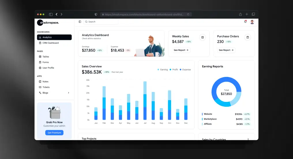
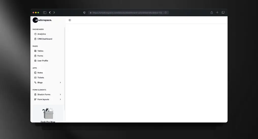
Admin Dashboard Sidebar

A navigation system with nested routes and grouped menus, scaled fully into multi-layer dashboards, addresses complex information architecture problems without overwhelming users. In any sidebar-supported navigation pattern, icons are available for all nodes, and sections can be collapsed.
This system is designed for applications where deep hierarchies are more important than simplicity. Moreover, it is a free and open-source shadcn sidebar with Figma design.
Key features:
- Multi-level navigation with collapsible groups
- Icon + label mapping for quick scanning
- Ideal for RBAC-based dashboards
- Works well with layout persistence
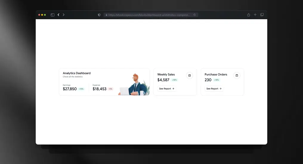
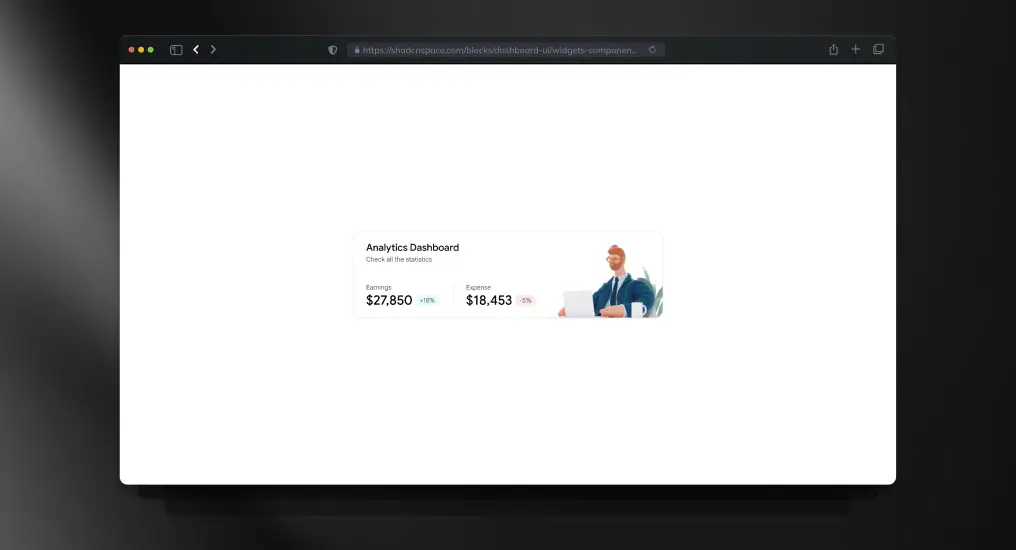
Best for: SaaS analytics dashboards, CRM systems
Mini Sidebar Navigation

A collapsed-first sidebar that prioritizes screen real estate while keeping navigation accessible through icons. Expands on interaction, making it suitable for dense dashboards where content space is critical. Reduces visual noise without sacrificing usability.
Key features:
- Icon-only default with hover/expand behavior
- Space-efficient layout for data-heavy screens
- Smooth transition states
- Minimal cognitive load
Best for: Trading dashboards, data visualization apps
Two Column Sidebar

Splits navigation into primary and secondary layers, improving hierarchy and reducing clutter. The first column handles top-level sections, while the second dynamically updates based on selection. Helps structure large apps without deep nesting.
Key features:
- Dual-layer navigation system
- Context-aware secondary menu
- Reduces deep nesting issues
- Better discoverability of features
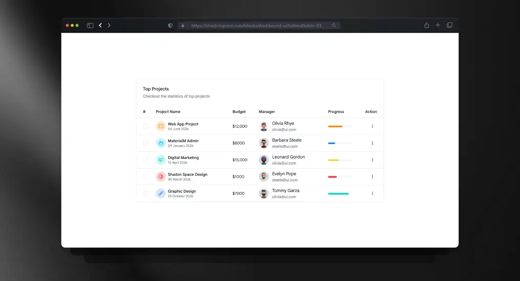
Best for: Enterprise tools, project management platforms
Compact Dashboard Navigation

A tighter, optimized version of a traditional sidebar that balances readability with space usage. Maintains labels but reduces padding and spacing for higher information density. Works well when you need both clarity and efficiency.
Key features:
- Reduced spacing without hurting usability
- Optimized for medium-density dashboards
- Clean alignment and grouping
- Faster navigation scanning
Best for: Internal tools, admin panels with moderate complexity
Admin Sidebar with Promo

Combines navigation with a promotional or informational section, typically used for upgrades, announcements, or feature highlights. Adds a product growth layer directly into the UI without interrupting workflows.
Key features:
- Embedded promo or CTA section
- Supports feature announcements
- Maintains navigation clarity
- Useful for product-led growth flows
Best for: SaaS products with upsell flows
Shadcn Responsive Sidebar

A mobile-first sidebar that switches among drawer, overlay, and fixed layouts based on screen size. Designed for seamless transitions across devices while maintaining consistent navigation logic. Ensures usability across breakpoints.
Key features:
- Drawer-based mobile navigation
- Adaptive layout behavior
- Touch-friendly interactions
- Works with responsive layout systems
Best for: Cross-device SaaS apps, mobile dashboards
Shadcn Sidebar with Navigation

A flexible and extensible sidebar implementation from the open-source ecosystem. Focuses on composability, allowing developers to plug in routing, authentication, and dynamic menus easily. Ideal for custom builds.
Key features:
- Open-source and customizable
- Easy integration with routing logic
- Modular component structure
- Extendable for dynamic data
Best for: Custom dashboards, developer-first builds
Frequently Asked Questions
1. How do I manage active route highlighting in a Shadcn sidebar with Next.js?
Use the router from Next.js and compare the pathname with the nav item routes. Keep this logic outside UI components so you can re-use it across layouts.
2. Should I use a collapsible sidebar?
Yes, especially if your dashboard has a lot of data. Collapsible sidebars let you focus while keeping your navigation accessible.
3. What is the best way to structure sidebar navigation for large apps?
Use a config-driven approach. Store navigation as an array with nested children. This is helpful when roles, rules, or feature flags are involved.
Final Thoughts
In modern SaaS dashboards, the sidebar architecture affects routing, permission handling, layout persistence, and overall system maintainability. The right design will cut technical debt, boost developer speed, and keep navigation consistent as things get more complex.
When you’re using Shadcn to build your web app, go with the configuration-driven approach. A well-organised dashboard sidebar saves time, helps you scale, and keeps your front-end clean and easy to maintain.