Category: UI

  • Top 10 Shadcn UI Libraries for 2026

    shadcn/ui has evolved into a code-distribution layer for modern React applications built with Next.js and Tailwind CSS. Unlike traditional UI libraries, it ships source code directly into your project, meaning long-term maintainability, type safety, and architectural decisions become your responsibility.

    As the ecosystem grows, third-party registries and Shadcn UI libraries are emerging to extend it, but not all follow production-grade engineering standards.

    This list filters the ecosystem using measurable engineering signals, rather than relying on visual polish or hype. Evaluation covers installation workflow, GitHub activity, maintenance cadence, TypeScript strictness, accessibility compliance, React Server Component boundaries, and real-world integration with Next.js and Tailwind CSS.

    If you are building a production SaaS dashboard, analytics tool, internal admin panel, or marketing system, this checklist will help you validate before adopting any Shadcn extension.


    Checklist for best Shadcn UI libraries

    Before installing any Shadcn extension or registry, validate it against the criteria below.

    Validation AreaWhat to CheckWhy It Matters for Devs
    GitHub ActivityRelease frequency, issue response time, open PR age, contributor diversityIndicates long-term sustainability and reduced project risk
    Installation MethodSupports shadcn@latest add or clear npm, pnpm, yarn, bun setupReduces manual setup and integration errors
    TypeScript SupportStrict typing, no implicit any, clean build in strict modePrevents runtime issues and improves DX
    Next.js CompatibilityWorks with App Router, SSR safe, no hydration issuesCritical for production Next.js applications
    AccessibilityUses Radix primitives or follows ARIA standards, proper keyboard navigationEnsures accessibility compliance and usability
    Dark Mode SupportUses Tailwind tokens or CSS variablesPrevents theme conflicts in SaaS dashboards
    Component ModularityComponents are composable and not tightly coupledEnables reuse across multiple app sections
    Documentation QualityCode examples, prop documentation, real use casesReduces onboarding time for teams
    RSC CompatibilityProper “use client” boundaries, no unnecessary client component expansion, safe hydration patternsPrevents hydration bugs and improves performance in App Router
    Bundle & Dependency ImpactExternal dependencies (Framer Motion, GSAP), tree-shaking support, ESM compatibility, client boundary expansionPrevents unexpected performance regression in production builds

    Best Shadcn UI Libraries

    A curated list of the 10+ best Shadcn UI libraries built for real-world React and Next.js development. These libraries focus on usability, clean structure, and smooth integration.
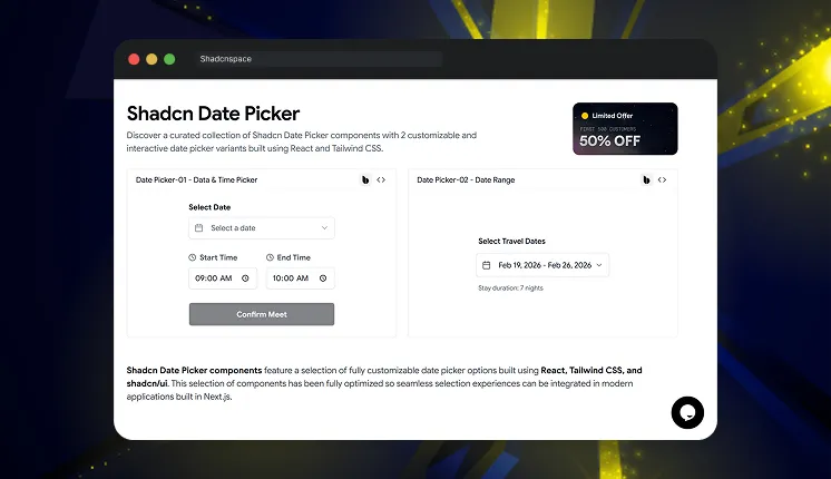

    Shadcn Space

    Shadcn Space

    Shadcn Space provides high-quality components, Shadcn UI blocks, and dashboard shells built for React-based projects. It focuses on layout scaffolding, CLI integration, and design to code workflow.  The project includes registry support and modern installation tooling.

    Tech stack: ShadcnUI v3.5, Radix UI v1, Base UI v1, React v19, Next.js v16, Tailwind CSS v4

    GitHub Stars: 330

    Last Updated: Jan 2026

    Key features:

    • 100+ UI components and structured sections
    • Light and dark mode support is built into components
    • Open in v0 support for rapid prototyping
    • Figma preview and design reference link
    • CLI documentation for registry-based installs
    • Supports npm, pnpm, yarn, and bun installation
    • Supports MCP Server

    Kibo UI

    Kibo UI

    Kibo UI extends Shadcn with higher-order components beyond base primitives. It includes structured business logic components for production apps. Designed for data-heavy dashboards and internal tooling.

    Tech stack: ShadcnUI v3.5, Radix UI v1, React v19, TypeScript v5, Tailwind CSS v4

    GitHub Stars: 3.6K+

    Last Updated: Dec 2025

    Key features:

    • Registry-based installation workflow
    • Advanced data tables with sorting and filtering
    • Complex input components and validation patterns
    • Accessible components built on Radix primitives
    • TypeScript first architecture
    • Clear usage documentation with examples

    Kokonut UI

    Kokonut UI

    Kokonut UI provides animated UI components aligned with Tailwind CSS and shadcn/ui conventions. It focuses on interaction-driven interfaces and marketing layouts. Commonly used in SaaS landing pages.

    Tech stack: ShadcnUI v3.5, Next.js v16, React v19, Radix UI v1, Tailwind CSS v4

    GitHub Stars: 1.8K+

    Last Updated: Jan 2026

    Key features:

    • 100+ animated and static components
    • Motion integration using Framer Motion
    • Tailwind utility-based styling consistency
    • Copy-ready registry components
    • Live component previews
    • Light and dark compatible styling patterns

    8bitcn

    8bitcn

    8bitcn by TheOrcDev delivers retro-styled UI components for shadcn projects. It blends pixel aesthetic design with accessibility practices. Suitable for creative dashboards and niche branding.

    Tech stack: ShadcnUI v3.7, Radix UI v1, React v19, Next.js v16, Tailwind CSS v4

    GitHub Stars: 1.6K+

    Last Updated: Feb 2026

    Key features:

    • Retro-themed component system
    • Accessible focus states and keyboard navigation
    • Registry-compatible copy workflow
    • Consistent Tailwind utility structure
    • Dark mode compatible component

    SmoothUI

    SmoothUI

    SmoothUI focuses on animated sections built for marketing and product pages. It integrates motion logic with shadcn style component structure. Designed for controlled animation workflows.

    Tech stack: ShadcnUI v3.5, GSAP, React v19, Tailwind CSS v4

    GitHub Stars: 685

    Last Updated: Feb 2026

    Key features:

    • Hero, pricing, testimonial animation blocks
    • Motion prop-based configuration
    • Works alongside the shadcn registry components
    • Tailwind structured styling
    • Lightweight integration setup

    Cult UI

    Cult UI

    Cult UI provides reusable React components aligned with accessibility standards. It supports structured layouts for application interfaces. Often included in curated shadcn ecosystem lists.

    Tech stack: ShadcnUI v3.5, Vite v4, React v19, Tailwind CSS v4

    GitHub Stars: 3.3K+

    Last Updated: Feb 2026

    Key features:

    • Accessible modal and navigation components
    • Form patterns built with TypeScript
    • Layout primitives for Next.js projects
    • Tailwind-driven spacing system
    • Compatible with the shadcn registry approach

    UI Layouts

    UI Layouts

    UI Layouts supplies dashboard scaffolds and layout foundations. It reduces the time spent building sidebars and routing structures, enabling a focus on admin and internal tool setups.

    Tech stack: ShadcnUI v3.5, Framer Motion, React v19, Tailwind CSS v4

    GitHub Stars: 3.2K+

    Last Updated: 2024

    Key features:

    • Multiple dashboard layout templates
    • Sidebar, header, and nested routing skeletons
    • Ready layout states for quick integration
    • Tailwind-based configuration
    • Compatible with shadcn components

    ReUI

    ReUI

    ReUI is another good shadcn/ui library that offers accessible UI patterns with theme support. It emphasizes structured forms and interaction components. Designed for application first development.

    Tech stack: ShadcnUI v3.8, Base UI v1, React v19, Radix UI v1, Tailwind CSS v4

    GitHub Stars: 2.5K+

    Last Updated: Feb 2026

    Key features:

    • Accessible dropdowns and popovers
    • Structured form components
    • Theme-aware class patterns
    • TypeScript support
    • Compatible with Radix patterns

    Efferd

    Efferd

    Efferd delivers minimal Shadcn styled components for simple dashboards. It focuses on reducing dependency complexity. Useful when UI needs are straightforward.

    Tech stack: ShadcnUI v3.5, Next.js v16, React v19, Radix UI v1, Tailwind CSS v4

    GitHub Stars: 127

    Last Updated: Dec 2025

    Key features:

    • Minimal card and table components
    • Low dependency footprint
    • Quick integration with Tailwind projects
    • Lightweight structure
    • Compatible with shadcn patterns

    TweakCN

    TweakCN

    TweakCN is a visual theme editor for Shadcn UI projects. It allows developers to modify Tailwind variables through a UI. Designed for branding and refining the design system.

    Tech stack: ShadcnUI v2.5, Next.js v15, React v19, Radix UI v1, Tailwind CSS v4

    GitHub Stars: 9.4K+

    Last Updated: Dec 2025

    Key features:

    • Visual theme customization interface
    • Tailwind variable editor
    • Theme preset system
    • Export-ready configuration
    • Works with npm, pnpm, yarn, and bun setups

    Frequently Asked Questions

    1. Is Shadcn UI production-ready for enterprise SaaS?

    shadcn/ui is production-safe because it ships source code directly into your project. However, third-party registries must be validated for their maintenance cadence, TypeScript strict mode, and compatibility with the Next.js App Router before being rolled out to an enterprise.


    2. Do Shadcn UI libraries work with React Server Components?

    Yes, if they implement correct use client boundaries and avoid unnecessary client-side expansion. Always test production builds to detect hydration mismatches.


    3. How do Shadcn extensions affect bundle size?

    Libraries that depend on animation frameworks such as Framer Motion or GSAP can increase the JavaScript payload. Measure bundle output using the next build and validate Lighthouse scores before committing to production.


    Final Thoughts

    The Shadcn ecosystem is expanding rapidly, but component count alone should not drive adoption. When evaluating any extension, think beyond visuals: consider long-term maintainability, React Server Component compatibility, TypeScript rigor, and bundle performance.

    Libraries built on top of shadcn/ui give you ownership of code. That flexibility is powerful, but it also means the team inherits technical debt if validation is skipped.

    In 2026, frontend advantage won’t come from having more components. It will come from choosing the right architectural foundations.

  • 9+ Best Free Shadcn Date Picker Components for React and Next.js in 2026

    Most modern apps require date pickers – from SaaS dashboards and booking systems to analytics filters and admin panels.

    We tested and reviewed 9 free Shadcn date picker components from real repositories and component libraries. This list focuses on real developer needs, such as timezone handling, date ranges, form integration, and production readiness.

    This guide is based on actual component code, GitHub activity, TypeScript support, and integration with React and Next.js.


    How We Tested These Components

    We installed and tested each react date picker in a modern Next.js App Router project to verify real-world compatibility.

    We validated every component for:

    • Installation inside Next.js App Router
    • Tested with strict TypeScript mode enabled
    • Controlled and uncontrolled usage patterns
    • Integration with react-hook-form
    • Date range and datetime behavior
    • Timezone handling (where supported)
    • SSR and hydration safety
    • Dependency footprint (react-day-picker, date-fns, etc.)
    • GitHub activity and maintenance status

    We only included components that are actively maintained, reusable, and production-ready.

    All components listed here are 100% free and open source.

    Across the list, you’ll find support for three primary selection modes:

    • Date Picker – Select a single calendar date
    • Date & Time Picker -Allows selection of both date and time
    • Date Range Picker – Select a start and end date

    When you should use a Shadcn date picker

    Shadcn date pickers are ideal for:

    • SaaS analytics dashboards for filtering data by date
    • Booking and scheduling systems – for single or range date selection
    • Admin panels with reporting filters
    • Financial tools that analyze data-based metrics
    • CRM systems that track activity history
    • Any application already using shadcn/ui and Tailwind CSS

    How to Choose the Right Date Picker


    Quick Comparison Table

    If you prefer a quick overview before diving into implementation details, here’s a side-by-side comparison:


    Best Free Shadcn Date Picker Components

    Below is a curated list of free, production-ready Shadcn date picker components. Each component has been thoroughly tested for integration with React, Next.js, TypeScript, and Tailwind CSS.


    Shadcn Space Date Picker

    Shadcn Space Date Picker

    This collection provides multiple ready-to-use date picker components built specifically for shadcn/ui projects. It includes standard date pickers, calendar popovers, and form-integrated pickers. All components follow shadcn component architecture, making them easy to integrate into existing projects.

    Tech stack: ShadcnUI v3.5, Radix UI v1, Base UI v1, React v19, TypeScript v5, Tailwind CSS v4

    Last Updated: Feb 2026

    Key features:

    • Includes calendar, popover, and input-based picker patterns
    • Uses composable shadcn component structure
    • Clean TypeScript component implementation
    • Supports form integration with controlled inputs
    • Compatible with Next.js server and client components

    Best for: SaaS dashboards, admin panels, and internal tools


    Tailwindadmin Shadcn Date Picker

    Tailwindadmin Shadcn Date Picker

    This component provides production-ready date picker examples used in real dashboard interfaces. It includes calendar dropdown picker and input-based picker implementations. The code follows modular patterns suitable for scalable dashboard systems.

    Tech stack: ShadcnUI v3.5, Next.js v16, React v19, TypeScript v5, Tailwind CSS v4

    Last Updated: Feb 2026

    • Dashboard-focused picker UI patterns
    • Modular component separation
    • Clean Tailwind utility usage
    • Designed for analytics and reporting filters
    • Works well inside complex form systems

    Best for: Admin dashboards and analytics interfaces


    Shadcn Datetime Picker by huybuidac

    Shadcn Datetime Picker by huybuidac

    This is a powerful and fully customizable component that simplifies date and time selection in React applications built with the Shadcn UI framework. With advanced features designed to enhance the user experience, this datetime picker provides seamless integration and a responsive, user-friendly interface. Whether you need a robust datetime, date, or time picker, this provides the flexibility and functionality needed for modern applications.

    Tech stack: ShadcnUI v2, Next.js v14, React v18, Radix UI v1, Tailwind CSS v3

    GitHub Stars: 202

    Last Updated: 2024

    Key features:

    • Combined date and time picker support
    • Timezone support for global apps
    • Min and max date validation
    • Custom trigger rendering support
    • Works with React state and form libraries

    Best for: SaaS apps with timezone and datetime requirements


    Date Range Picker for Shadcn by johnpolacek

    Date Range Picker for Shadcn by johnpolacek

    This is a reusable component built for Shadcn using beautifully designed components from Radix UI and Tailwind CSS. It provides a dropdown interface to allow users to select or enter a range of dates and includes additional options such as preset date ranges and an optional date comparison feature.

    Tech stack: Radix UI v1, Mocha.js v10, React v18, Jest v29.5, Tailwind CSS v3

    GitHub Stars: 1K+

    Last Updated: 2024

    • Native date range selection support
    • Optimized for analytics filtering
    • Clean range selection state logic
    • Works with controlled components
    • Designed for dashboard usage

    Best for: Analytics dashboards and reporting systems


    Shadcn Date Picker by flixlix

    Shadcn Date Picker by flixlix

    This custom Shadcn component aims to provide a more advanced alternative to the default date picker component. It is built on top of the react-day-picker library, which provides a wide range of customization options.

    Tech stack: ShadcnUI v2.6, Next.js v15, Radix UI v1, React v19, Tailwind CSS v3

    GitHub Stars: 363

    Last Updated: Dec 2025

    • Single date selection
    • Date range selection
    • Month and year navigation
    • Easy integration into existing UI systems
    • Supports Light & Dark Mode

    Best for: General application date selection


    Shadcn Calendar Component by sersavan

    Shadcn Calendar Component by sersavan

    This is a reusable calendar and date range picker built for shadcn/ui projects. It is designed for React and Next.js apps using TypeScript and Tailwind CSS. The component focuses on clean UI, easy customization, and smooth date selection. It helps developers quickly add flexible calendar functionality to modern web applications.

    Tech stack: Next.js v14, Radix UI v1, Zod v3, React v18, Tailwind CSS v3

    GitHub Stars: 327

    Last Updated: Dec 2025

    • Single date and date range selection support
    • Easy state management
    • Timezone-aware date handling 
    • Predefined date ranges like Today, Last 7 Days, This Month
    • Minimal setup required

    Best for: Custom calendar integrations


    Shadcn Date Time Picker by Rudrodip

    Shadcn Date Time Picker by Rudrodip

    This project features a range of Date and Time picker components built with ShadCN. These examples demonstrate the versatility and functionality of the component across various use cases.

    Tech stack: Next.js v14, Radix UI v1, Zod v3, React v18, Tailwind CSS v3

    GitHub Stars: 283

    Last Updated: May 2025

    • Supports combined date and time selection
    • Date range & 12h formats available 
    • Integrates with react-hook-form and Zod for form handling & validation 
    • Clean TypeScript implementation
    • Live examples with copy/view code UI for quick implementation 

    Best for: Booking systems and scheduling apps


    Shadcn Datetime Picker by Maliksidk19

    Shadcn Datetime Picker by Maliksidk19

    This project provides a beautifully crafted datetime picker component built using the Shadcn UI. It offers an intuitive interface for selecting dates and times in React applications.

    Tech stack: Next.js v15, Radix UI v1, React v19, Tailwind CSS v3

    GitHub Stars: 266

    Last Updated: March 2025

    • Supports combined datetime selection
    • Works with controlled input components
    • Customizable Layout
    • Easy integration into dashboards
    • Lightweight implementation

    Best for: Internal tools and admin apps


    Shadcn Persian Calendar by MehhdiMarzban

    Shadcn Persian Calendar by MehhdiMarzban

    This is a beautiful, accessible, and customizable Persian (Jalali) date picker component for React applications built with Shadcn UI components.

    Tech stack: Next.js v15, Radix UI v1, React v19, Tailwind CSS v3

    GitHub Stars: 27

    Last Updated: Feb 2025

    • Persian calendar support
    • Single date, range, and multiple date selection modes
    • Accessible (WAI-ARIA compliant)
    • Year switcher
    • Supports Dark mode

    Best for: Persian and regional applications


    Frequently Asked Questions

    Date pickers from Shadcn Space and Tailwindadmin are strong choices because their components are regularly updated and well-maintained. They offer support for analytics filtering and are built with a scalable component architecture, making them reliable for growing applications.


    The datetime picker by huybuidac supports timezone selection, min date, and max date validation. This is useful for global SaaS applications.


    Yes, all components are built with React, TypeScript, and Tailwind CSS, and work directly in Next.js apps.


    Final Thoughts

    These 9 free shadcn date picker components provide production-ready solutions for modern applications. They support core needs like date selection, datetime input, analytics filtering, and scheduling.

    For most SaaS and dashboard applications, the datetime picker by Shadcn Space and the date range picker by johnpolacek provide the best flexibility and scalability.

    If you’re building with shadcn/ui, you can also explore our curated collection of shadcn blocks to quickly create modern pages and layouts. We’ve also prepared a detailed guide on shadcn libraries that you can check out to discover more useful tools for your projects.

  • 25+ Top UI frameworks & libraries for Next.js

    If you are overwhelmed with dozens of UI frameworks and libraries available, you are not alone as a developer. With so many UI Frameworks for Nextjs each claiming to be the best it’s tough to decide which one truly fits your project. 

    Popular frameworks like Material UI have millions of NPM downloads, proving their widespread adoption. But is it a perfect fit for your project? 

    This guide discusses 25+ UI frameworks and libraries for Next.js, from feature-rich giants to lightweight newcomers, helping you find the perfect match for your Next.js project. 

    Let’s break it down!

    What Are UI Frameworks & Libraries for Next.js?

    By offering pre-built elements like buttons, forms, and modals, UI frameworks and libraries for Next.js enable developers to create interfaces more quickly and effectively. 

    UI frameworks for Nextjs offer complete design systems with themes, while UI libraries for Nextjs focus on unstyled, customizable components.

    Using a UI framework ensures speedier development, responsive design, and consistency across projects. Libraries help increase performance by optimizing components for speed and accessibility.

    Whether prioritizing speed or customization, developers can find the perfect UI solution to match their Next.js project needs.

    List of UI Frameworks & Libraries for Next.js

    Next.js often partners with React-based UI solutions; therefore, most of them fall under libraries, but some, like Ant Design and Material UI, offer full-fledged frameworks. These options range from simple toolkits to comprehensive design systems, giving developers flexibility in choosing their ideal UI approach.

    Frameworks & Libraries for Next.js at a Glance 

    Libraries/FrameworksNPM DownloadsWebsites Using ItBest For
    1. Material UI (MUI)6 million weekly downloads182,000  Material Design principles
    2. Tailwind CSS16 million weekly downloads414,000 custom designs
    3. Chakra UI7 lakh weekly downloads38,600Themeable & responsive design 
    4. ShadCN UI122,529 weekly downloads45,000Streamlined component library
    5. Ant Design1.6 million weekly downloads41,200Scalable enterprise applications
    6. RSuite98,373 weekly downloads Stats still growingEnterprise-level applications
    7. Headless UI2,60,0967 weekly downloads41, 300Operational unstyled components
    8. Flowbite411,345 weekly downloads21,945Responsive user interfaces
    9. NextUI90,364 weekly downloads420Fast & modern design
    10. Radix UI184,997 weekly downloads80,800High-quality components
    11. OneUI119 weekly downloadsStats still growingLightweight builds 
    12. Himalaya-UI214 weekly downloadsStats still growingLightweight projects 
    13. Metro UI30 weekly downloads190Microsoft’s Metro design principles
    14. Evergreen12,000 weekly downloadsStats still growingB2B enterprise applications 
    15. Rebass37,683 weekly downloadsStats still growingDesign-conscious projects
    16. DaisyUI369,387 weekly downloads1,900Tailwind-based projects
    17. V0 by VercelStats still growingStats still growingBuilding custom workflows
    18. Magic UI641 weekly downloadsStats still growingContemporary  design 
    19. Supabase UI 1241 weekly downloadsStats still growingData-driven applications
    20. Preline36,781730 Contemporary components 
    21. JollyUIStats still growingStats still growingLightweight framework
    22. dynauiStats still growingStats still growingLightweight projects 
    23. FrankenUI3,849 weekly downloadsStats still growingSmall-scale applications
    24. KokonutuiStats still growingStats still growingContemporary designs
    25. KendoReact UI by Telerik9,757 weekly downloads25,800Flexibility and customization 
    26. SaaS UI3,388 weekly downloadsStats still growingSaaS applications 

    The statistics mentioned in the table are till date (April 2025) – taken from the sources: NPM and Wappalyzer

    Material UI (MUI)

    A comprehensive React component library that implements Google’s Material Design. With customizable components and a flexible theming system, developers can craft visually striking apps effortlessly. Colors, fonts, and styles are easily tweaked, while the extensive component selection ensures versatility. 

    This comprehensive toolkit empowers creators to build polished interfaces that embody Material Design principles.

    • Type: React UI framework with Material Design
    • NPM Downloads:  6 million weekly downloads
    • Websites Using It: 188,000 

    Tailwind CSS

    Tailwind CSS empowers developers with utility classes for custom design. Applied directly in markup, these low-level tools offer unparalleled styling flexibility. 

    This framework streamlines custom component creation, boosting efficiency without sacrificing creativity.

    • Type: Utility-first CSS framework
    • NPM Downloads: 16 million weekly downloads
    • Websites Using It: 414,000 

    Chakra UI

    A modular and accessible React component framework that provides composable and themeable components. It enables for theme modification and component styling using props. Supports bright and dark modes seamlessly.

    • Type: React component library
    • NPM Downloads: 7 lakh weekly downloads
    • Websites Using It: 38,600

    ShadCN UI

    ShadCN UI is a contemporary and streamlined component library that utilizes Radix UI primitives. It offers unstyled but completely functional components that developers can tailor to fit their project requirements.

    • Type: UI Library with Radix UI
    • NPM Downloads: 122,529 weekly downloads
    • Websites Using It: 45,000

    Ant Design

    A widely-used UI framework featuring a design system suitable for enterprise-level applications. It offers a collection of top-notch React components, mainly intended for business applications.

    • Type: Enterprise-level UI framework & library
    • NPM Downloads: 1.6 million weekly downloads
    • Websites Using It: 41,200

    RSuite

    RSuite is a feature-rich UI library designed for creating enterprise-level applications, providing a wide range of components that fully support server-side rendering, which makes it an excellent option for Next.js.

    • Type: UI Library 
    • NPM Downloads: 98,373 weekly downloads 
    • Websites Using It: Adoption is increasing

    Headless UI

    Developed by the Tailwind CSS team, Headless UI provides you with accessible, fully operational unstyled components, allowing you to design freely with your own style.

    • Type: Completely unstyled, fully accessible UI Library
    • NPM Downloads: 2,60,0967 weekly downloads
    • Websites Using It: 41, 300
    Need speed + flexibility?

    Flowbite

    Flowbite enhances Tailwind CSS by providing a collection of styled components, enabling developers to create responsive user interfaces more quickly and with less decision-making. Its server-side rendering support makes it an excellent choice for Next.js.

    • Type: Tailwind UI Component Library
    • NPM Downloads: 411,345 weekly downloads 
    • Websites Using It: 21,945

    NextUI – HeroUI

    NextUI is a fast, modern UI library tailored specifically for Next.js apps. It provides an attractive and easily customizable collection of components and features like lazy loading built for maximum performance and an enhanced developer experience.

    • Type: UI Library for Next.js 
    • NPM Downloads: 90,364 weekly downloads
    • Websites Using It: Gaining popularity among Next.js developers

    Radix UI

    Radix UI offers a collection of accessible, unstyled, and premium components that developers can utilize as a base for their personalized UI designs. It is optimized for Next.js and integrates seamlessly with Tailwind CSS.

    • Type: UI Component Library
    • NPM Downloads:  184,997 weekly downloads
    • Websites Using It: 80,800 

    Minimal & Lightweight UI Framework/Libraries

    OneUI

    A streamlined component library designed for compact bundles and quick rendering. Perfect for projects that need lightweight builds.

    • Type: Minimal React component UI library 
    • NPM Downloads: 119 weekly downloads 
    • Websites Using It: Users are gradually growing

    Himalaya-UI

    Himalaya-UI is crafted for developers who appreciate sleek interfaces, providing a lightweight solution with thoroughly documented React components.

    • Type: Light & Clean UI library 
    • NPM Downloads: 214 weekly downloads 
    • Websites Using It: Numbers are fluctuating

    Metro UI

    A UI framework built on React, influenced by Microsoft’s Metro design principles. Ideal for applications that need a desktop-like user interface.

    • Type:  Metro Style component UI library
    • NPM Downloads: 30 weekly downloads
    • Websites Using It: 190

    Evergreen 

    Evergreen is a UI library for React developed by Segment, tailored for web applications of enterprise scale. It emphasizes ease of use, accessibility, and uniform design, providing a collection of refined, ready-to-use components for production.

    • Type: React UI Framework
    • NPM Downloads: 12,000 weekly downloads
    • Websites Using It: Widely used in B2B SaaS products and internal tools

    Rebass

    Rebass is a small, themeable component library based on the Styled System. It offers fundamental UI components such as buttons, cards, and forms, making it ideal for projects where customization and performance are essential.

    • Type: Minimal UI Component Library
    • NPM Downloads:  37,683 weekly downloads
    • Websites Using It: Commonly used in lightweight, design-conscious projects.

    New & Rising UI Libraries

    DaisyUI

    DaisyUI is a versatile component library that is built upon Tailwind CSS. It enhances Tailwind with ready-to-use themes and components, simplifying the process of creating cohesive and attractive designs without the need for custom CSS.

    • Type: UI Library for Tailwind CSS
    • NPM Downloads: 369,387 weekly downloads
    • Websites Using It: 1,900

    V0 by Vercel

    An innovative UI library driven by AI from Vercel that facilitates the easy generation and customization of UI components for developers. Tailored for smooth integration with Next.js projects.

    • Type: UI Library & Design Tool
    • NPM Downloads: Relatively new, stats still growing
    • Websites Using It: Adoption is increasing, especially within the Vercel ecosystem.

    Magic UI

    Magic UI incorporates engaging, animated components into your Next.js application, merging contemporary design styles with practical UI elements.

    • Type: UI Library for Animated Components
    • NPM Downloads: 641 weekly downloads 
    • Websites Using It: User Base is small 

    Supabase UI Library

    A component library and design system utilized by Supabase, perfect for developing applications that are data-driven and require user authentication.

    • Type: UI for Supabase Apps
    • NPM Downloads: 1241 weekly downloads 
    • Websites Using It: Adoption is increasing

    Preline 

    Preline is a sleek and adaptable UI library designed using Tailwind CSS, featuring contemporary components that are perfect for web applications, landing pages, and administrative dashboards.

    • Type: Tailwind-based UI Library
    • NPM Downloads: 36,781
    • Website Using it: 730 

    Check out Modernize Preline Tailwind Admin Template
    Stylish, developer-oriented design created by our reliable partner.

    JollyUI

    A new UI kit featuring a lively design system, JollyUI is attracting interest due to its lightweight framework and diverse components.

    • Type: Modern UI Kit library 
    • NPM Downloads: Data not available 
    • Website Using it: No accurate figure 

    DynaUI

    A compact yet effective component library centered on streamlined architecture and optimization, dynaui integrates seamlessly into lightweight React and Next.js configurations.

    • Type: UI Component Library
    • NPM Downloads: New to market, numbers not available 
    • Website Using it: No accurate figure 

    FrankenUI

    An eccentric and highly adaptable library that allows you to stitch together components. Excellent for quick prototyping and small-scale applications.

    • Type: UI Component Library
    • NPM Downloads: 3,849 weekly downloads 
    • Website Using it: No exact number 

    Kokonutui

    Kokonutui is an innovative UI library featuring distinctive styling and a striking design language, offering a creative spin on contemporary user interfaces.

    • Type: Tropical UI Library
    • NPM Downloads: New to market, numbers are growing 
    • Website Using it: Data not available

    KendoReact UI by Telerik

    A commercial library of UI components featuring over 100 high-performance widgets designed for React applications. Renowned for its professional-quality standards, accessibility, and flexibility in customization.

    • Type: UI Framework
    • NPM Downloads: 9,757 weekly downloads
    • Websites Using It: 25,800

    SaaS UI

    Designed exclusively for SaaS applications, SaaS UI features authentication, onboarding processes, and analytics elements—all tailored for Next.js.

    • Type: UI Library for SaaS Apps
    • NPM Downloads: 3,388 weekly downloads 
    • Websites Using It: Popular among SaaS startups, numbers are increasing

    Wrapping it up: Build Smarter, Not Harder

    Speed, flexibility, or scalability–whatever your need, this blog covers 25+ best UI Frameworks for Nextjs and UI Libraries for Nextjs to choose from. 

    From comprehensive options such as Material UI to simpler alternatives like Rebass, every UI Library brings something unique to the table.

    Are you prepared to enhance your Next.js project?


    Constructed using well-known tech stacks such as Next.js and many others like Bootstrap, React, Angular, and Vue, which are ideal for developers who prioritize quick deployment and sleek design.

  • The Efficiency of Tailwind CSS: A Game-Changer for Frontend Developers

    The journey of CSS frameworks has been nothing short of a rollercoaster. From the days when styling a website felt like taming a wild beast, to the advent of frameworks that promised to simplify this process, we’ve come a long way. Traditional CSS, with its cascading nature, was a powerful tool for styling the web but often led to complexity and challenges as projects grew.

    Developers found themselves wrestling with specificity wars, maintaining large style sheets, and trying to keep their designs consistent across a sprawling website. Frameworks like Bootstrap and Foundation entered the scene, offering a beacon of hope with their ready-to-use components and grid systems. While they significantly improved productivity, they also introduced their own set of challenges. Developers frequently had to override styles to fit their design needs, leading to bloated CSS and a departure from the original design system these frameworks provided.


    What is Tailwind CSS ?

    Diving deeper into the heart of modern frontend development, we encounter a concept that’s reshaping how we think about styling web applications: utility-first CSS. At the forefront of this transformative wave is Tailwind CSS, a framework that has fundamentally altered the landscape of web design and development. Let’s explore what Tailwind CSS is, its utility-first approach, and why it’s becoming an indispensable tool for frontend developers around the globe.

    Let’s Learn Tailwind CSS Basics

    Tailwind CSS, crafted by Adam Wathan, emerged from a simple yet revolutionary idea: instead of fighting against CSS, why not leverage its strengths to our advantage? Tailwind provides a set of low-level utility classes that can be combined directly in your HTML, enabling you to build complex, responsive designs without ever leaving your markup. This approach marks a departure from traditional CSS and component-based frameworks, offering a level of flexibility and efficiency previously unseen.

    The Utility-First Paradigm

    At its core, Tailwind CSS champions a utility-first methodology. This means that instead of starting with abstracted components or styling from a global stylesheet, developers begin with a palette of functional utility classes that apply specific CSS properties. Think of Tailwind as giving you the building blocks to construct your design directly in the HTML, block by block.

    <div class="bg-gray-800 text-white p-5 rounded-lg shadow-lg">
      <h1 class="text-2xl font-bold">Hello, Tailwind!</h1>
      <p class="mt-3">Welcome to the utility-first world of CSS.</p>
    </div>

    In this snippet, bg-gray-800 sets the background color, text-white defines the text color, p-5 applies padding, rounded-lg gives the corners a large radius, and shadow-lg adds a large shadow. Each class name is intuitive, reflecting the style property it applies, making your markup both the blueprint and the canvas of your design.

    Why Tailwind CSS Stands Out

    Tailwind CSS’s utility-first approach has several distinct advantages:

    • Rapid Prototyping: Tailwind speeds up the design process, allowing for quick iterations directly in the HTML.
    • High Customizability: Tailwind can be extensively customized to fit your project’s design needs. With Tailwind’s configuration file, tailoring your design system is as straightforward as modifying a JavaScript object.
    • Reduced Styling Redundancy: By using utility classes, you avoid repeating styles, leading to DRYer (Don’t Repeat Yourself) code.
    • Consistent Design Language: Tailwind enforces a consistent design language across your project, reducing the chances of deviating from the intended design.

    Tailwind CSS’s latest iteration, version 3.0, enhances these benefits with features like Just-in-Time (JIT) compilation, improved performance, and even more customization options. It’s not just a tool but a new way of thinking about styling web applications, encouraging a closer integration between design and development.

    One of the biggest advantages of Tailwind CSS is how easily it adapts to complex UI layouts, such as admin panels or data dashboards. That’s why many developers prefer starting their projects with Tailwind dashboard templates, which are pre-designed admin interfaces built entirely with Tailwind utilities.

    These templates take full advantage of Tailwind’s strengths, responsive grids, reusable components, and easy theme customization, allowing developers to launch a fully functional dashboard in hours instead of weeks or months. If you’re looking for inspiration or a ready-made foundation, you can explore some of the best Tailwind dashboard templates crafted by the WrapPixel team. They showcase exactly how Tailwind’s utility-first approach can be scaled to real-world, production-ready dashboards.

    The Growing Popularity of Tailwind CSS

    Since its inception, Tailwind CSS has seen a meteoric rise in popularity among frontend developers. Its approachable syntax, combined with the power and flexibility it offers, makes it a go-to choice for projects of all sizes. From solo developers crafting personal websites to large teams building complex web applications, Tailwind CSS has proven itself to be a game-changer.

    In conclusion, Tailwind CSS represents a paradigm shift in frontend development, emphasizing utility over convention, flexibility over rigidity, and efficiency over complexity. Its utility-first approach, championed by Adam Wathan, has not only won over a vast community of developers but has also set a new standard for how we approach web design. As Tailwind CSS continues to evolve, its impact on the industry is undeniable, paving the way for a more intuitive and enjoyable web development experience.

    Key Features of Tailwind CSS

    Tailwind CSS has swiftly risen through the ranks to become a favorite among frontend developers, thanks to its innovative features and design principles. Let’s delve into the key features of Tailwind CSS that set it apart from traditional CSS frameworks and methodologies.

    Utility-First Approach

    The utility-first approach of Tailwind CSS is a cornerstone of its design philosophy, offering unparalleled productivity and flexibility. This method provides developers with a suite of utility classes that can be composed to build any design directly within HTML markup. Unlike traditional CSS, where you might create bespoke classes for elements and then define their styling, Tailwind’s utility classes mean you’re effectively styling as you build your HTML structure.

    <button class="bg-blue-500 hover:bg-blue-700 text-white font-bold py-2 px-4 rounded">
      Click me
    </button>

    In this example, the utility classes clearly describe the button’s appearance: blue background, white text, bold font, padding, and rounded edges. Adding hover:bg-blue-700 changes the background color on hover, showcasing Tailwind’s intuitive approach to states and interactions.

    Responsiveness and Mobile-First Design

    Tailwind CSS embraces a mobile-first design philosophy, providing a fluid and responsive framework out of the box. By using Tailwind’s prefix system, developers can create designs that adapt to various screen sizes with minimal effort. This approach ensures that applications are accessible and user-friendly across all devices.

    <div class="text-sm sm:text-base md:text-lg lg:text-xl">
      Responsive text size
    </div>

    This snippet demonstrates how Tailwind CSS adjusts the text size based on the screen width, scaling up from text-sm on small screens to text-xl on larger screens. The sm:md:, and lg: prefixes apply styles at specific breakpoints, illustrating Tailwind’s responsive design capabilities.

    Customization and Configuration

    Tailwind CSS is highly customizable, allowing developers to tailor the framework to their project’s specific needs. Through the tailwind.config.js file, developers can define custom themes, breakpoints, and even extend the default set of utility classes. This level of customization ensures that Tailwind can adapt to any design system.

    module.exports = {
      theme: {
        extend: {
          colors: {
            'custom-blue': '#243c5a',
          },
          spacing: {
            '72': '18rem',
          },
        },
      },
    }

    Here, the configuration file is extended to include a custom color (custom-blue) and a new spacing value (72). These customizations are then available as utility classes within the project, for example, bg-custom-blue or p-72.

    Performance Benefits

    One of the most significant advantages of Tailwind CSS is its focus on performance. The utility-first approach, combined with Tailwind’s Just-in-Time (JIT) mode, ensures that only the styles you use are included in the final CSS bundle. This results in significantly smaller file sizes, faster loading times, and an overall more efficient application.

    Before JIT, developers had to be mindful of purging unused styles for production builds. With JIT mode enabled by default in Tailwind CSS 3.0, this is handled automatically, generating CSS on the fly and ensuring optimal performance.

    <!-- Only the utilities used are compiled, leading to minimal CSS output -->
    <div class="max-w-md mx-auto bg-white rounded-xl shadow-md overflow-hidden md:max-w-2xl">
      <div class="md:flex">
        <div class="p-8">
          <div class="uppercase tracking-wide text-sm text-indigo-500 font-semibold">Case study</div>
          <a href="#" class="block mt-1 text-lg leading-tight font-medium text-black hover:underline">Finding simplicity in complexity</a>
          <p class="mt-2 text-gray-500">Exploring the benefits of a utility-first CSS framework in modern web development.</p>
        </div>
      </div>
    </div>

    In this comprehensive example, each utility class contributes to the overall design, from the container’s max width and margin to the text styling and padding. The JIT compiler includes only these specific utilities in the final CSS, streamlining the styling process and enhancing performance.

    Tailwind CSS’s innovative features—utility-first design, built-in responsiveness, extensive customization, and performance optimization—make it an invaluable tool for modern web development. These capabilities allow developers to craft intricate designs with efficiency and precision, heralding a new era of frontend development.

    Why Tailwind CSS is a Game-Change?

    Tailwind CSS has emerged as a pivotal force in the world of web development, redefining how developers approach styling. Its innovative features not only streamline the development process but also enhance the overall design and collaboration among teams. Let’s explore why Tailwind CSS is considered a game-changer in the industry.

    Faster Prototyping

    Tailwind CSS accelerates the design process, enabling developers to quickly prototype and iterate on designs directly within HTML. This immediacy allows for rapid visualization of ideas, significantly reducing the time from concept to prototype. With Tailwind’s utility classes, you can style elements on the go, without the back-and-forth between CSS files and HTML.

    <!-- Quick prototyping with Tailwind CSS -->
    <div class="flex items-center justify-center min-h-screen">
      <div class="px-4 py-2 bg-blue-500 text-white rounded hover:bg-blue-700 transition duration-300">
        Quick Prototype
      </div>
    </div>

    In this snippet, we create a centered button with a hover effect in just a few lines of code, demonstrating how quickly a design can come to life.

    Improved Consistency

    Tailwind CSS promotes consistency across your projects by providing a standardized set of utility classes. This ensures that design elements remain uniform, regardless of who works on the project or when they contribute. By using predefined utilities, teams can maintain a coherent design system, reducing discrepancies and enhancing the user experience.

    <!-- Consistent design with utility classes -->
    <div class="text-gray-900 bg-gray-200 p-4">
      Consistent Styling
    </div>
    <div class="text-gray-900 bg-gray-200 p-4 mt-2">
      Across Elements
    </div>

    These examples show how easily consistency can be achieved across different elements using the same set of utility classes.

    Less CSS to Maintain

    One of the significant advantages of Tailwind CSS is the reduction in the amount of custom CSS that needs to be written and maintained. By leveraging Tailwind’s comprehensive suite of utilities, developers can style elements directly in HTML, minimizing the need for custom classes and extensive stylesheets. This leads to cleaner codebases and less maintenance over time.

    !-- Minimal custom CSS required -->
    <input class="form-input mt-1 block w-full border-gray-300 focus:border-indigo-500 focus:ring focus:ring-indigo-500 focus:ring-opacity-50 rounded-md shadow-sm" type="text" placeholder="Less CSS to maintain">
    

    This input field styled entirely with Tailwind classes illustrates the minimal need for custom CSS.

    Enhanced Team Collaboration

    Tailwind CSS facilitates better collaboration within development teams by providing a common language of utility classes. This standardization simplifies communication about design implementations and reduces the learning curve for new team members. With Tailwind, developers can easily understand and contribute to the project’s design without deep diving into complex CSS files.

    <!-- Easy collaboration with standardized utilities -->
    <div class="bg-white shadow overflow-hidden sm:rounded-lg">
      <div class="px-4 py-5 sm:px-6">
        Easy Team Collaboration
      </div>
    </div>

    In this component, the use of Tailwind classes makes it straightforward for any team member to modify or extend the design without extensive knowledge of the project’s CSS architecture.

    Tailwind CSS stands out not just for its technical merits but also for its impact on the workflow and culture of development teams. Its utility-first approach, combined with the benefits of faster prototyping, improved consistency, reduced maintenance, and enhanced collaboration, solidifies its position as a game-changer in frontend development. Tailwind CSS empowers developers to create more with less, pushing the boundaries of what’s possible in web design and development.

    Conclusion

    Tailwind CSS has undeniably revolutionized frontend development with its utility-first approach, offering unparalleled efficiency, consistency, and flexibility in web design. By significantly reducing the time required for prototyping, ensuring design uniformity across projects, minimizing the maintenance of custom CSS, and enhancing team collaboration, Tailwind CSS paves the way for a more streamlined and productive development process. Its impact on the future of frontend projects is poised to be profound, encouraging developers to rethink traditional CSS practices. Whether you’re building a small personal project or a large-scale web application, integrating Tailwind CSS can lead to cleaner code, faster development times, and a more enjoyable coding experience.

    Discover the efficiency and flexibility of Tailwind CSS and create dashboards that stand out.

    Start building better dashboards today with Wrappixel’s Tailwind templates.